Putting colors in your interior is not always a breeze. For a beautiful harmony, we choose "muted" nuances that have depth thanks to a high proportion of pigments. Then we apply the rule of two-thirds to one-third: a dominant color on two-thirds of the surface and a darker secondary color, but in the same tone, on the remaining third. Deco (furniture, cushions, vases ...), we play the touch of color in opposition that gives character while creating the surprise ... We give you the right mix of colors for a 100% deco interior.
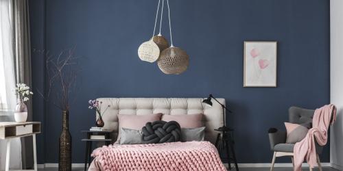
Turquoise and eggplant
Create an ambiance with harmonic oppositions: a dense eggplant and a bright turquoise. The game, risky, is successful thanks to the choice of cushions that make the link. They come in a range of blues whose richness is accentuated by shiny and silky materials almost rustling.
We combine blue and chocolate
Atmosphere "authentic nature" with a blue and a brown. Associated with bare materials, without retouching or frills, they give a feeling of authenticity, comfort.
Coral and gray for a perfect combination
An elegant style is given with the naturalness of both marine and aerial colors : the blue gray evokes a Finnish fjord or a stormy sky. It can be slightly sophisticated by fine black and white lines that emphasize the shape of the frames of doors and windows. A classic decor will tame the "hot" touch of coral that brings him the chic of audacity.
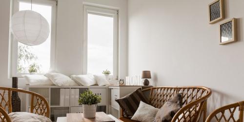
We create geometric shapes with three colors
By creating a grid pattern, each of the 3 colors is limited by a set of only black geometric lines. We dot our grid of colors, and the vast white beaches enlarge the space by structuring it. This realization is simple , it is just necessary that among the 3 colors, 2 are in the same tone and the 3rd in contrast.
We like anise
Chocolate, indigo, plum: anise especially plays the card of chic with deep colors.
A soft interior thanks to the powdery colors
Gray, pink, sand, three colors that work perfectly together. The rhythm of supermate colors organizes the space. The sand tone becomes chic with gray and a hint of pink, a little touch or accessories bring sweetness. These 3 soft colors give a feeling of "breathing".
We see life in pink
Pink without complex. It is a good color for the morale and its nuances, today, allow to put it in scene in all the rooms. Mat, he has acquired a certain refinement. It is highlighted with a black line way "eyeliner" for always more elegance.
We accentuate the curves
For a subtle finish : to paint the inner edge of the rounded table legs with a darker gray color, this makes the gable stand out beautifully. Contrast guaranteed.
Discover in our slideshow all the examples to implement for a chic interior thanks to the colorful paintings.